Todai
An AI life coach and planner for daily goals, habits and budgeting.
- Client
- Motto product
- Year
- 2026
- Platforms
- iOS · iPadOS · Android

Challenge
Todai needed one visual identity (icon, store copy and screenshots) that could hold up across 16 Apple locales and a Google Play listing with its own separate title.
Solution
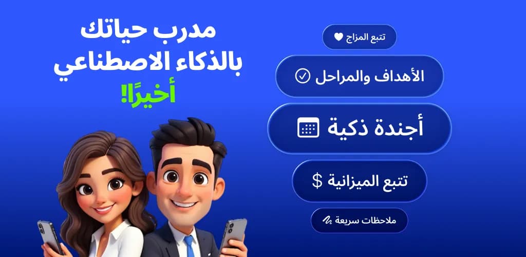
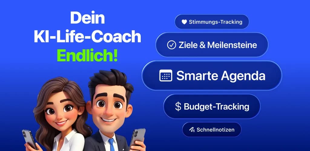
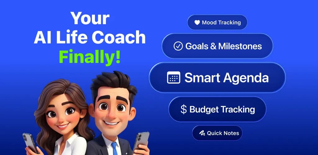
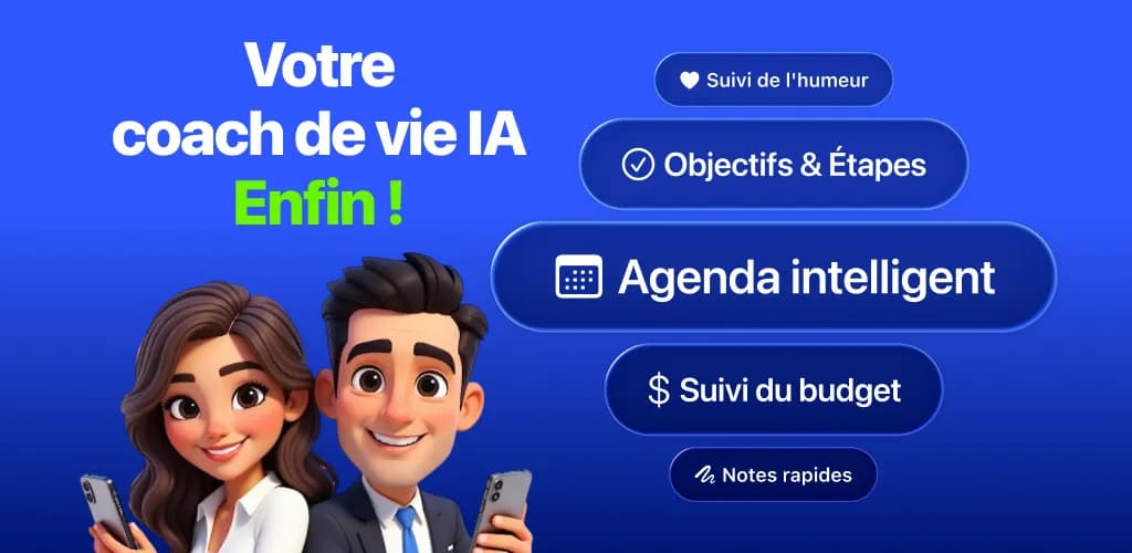
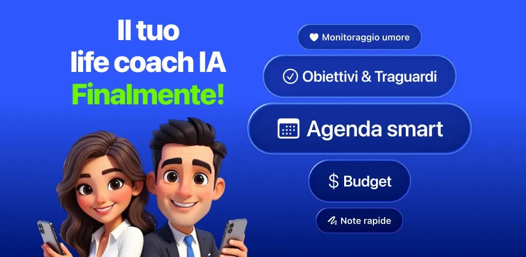
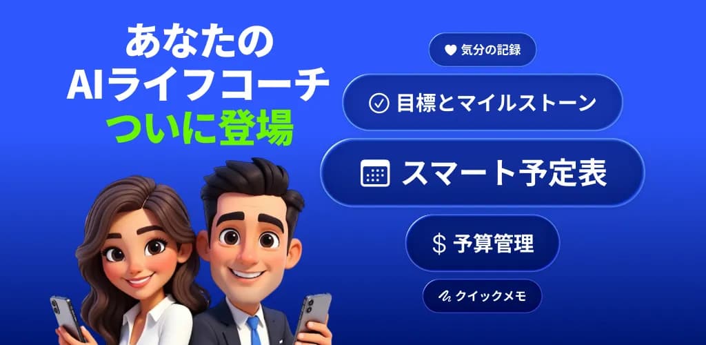
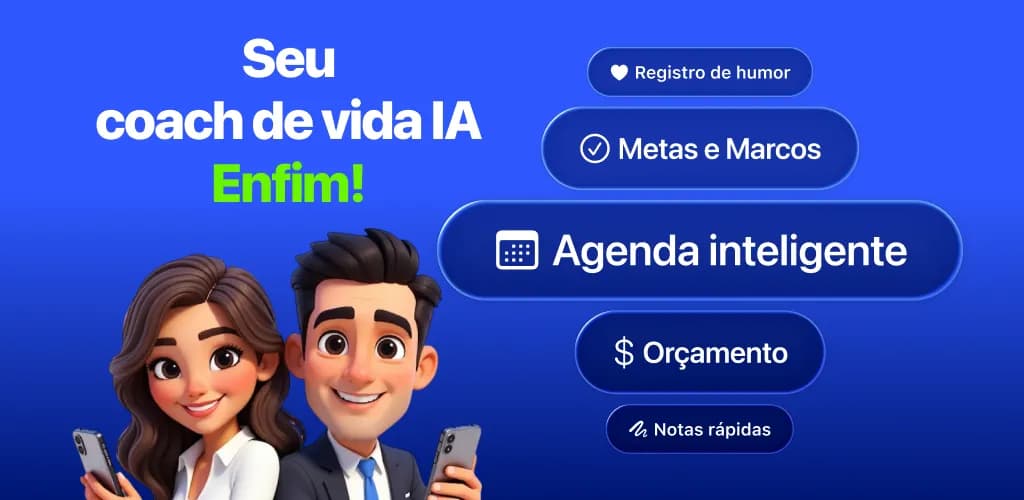
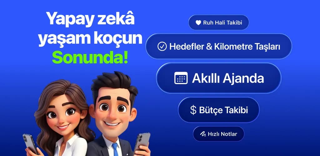
The icon was designed to read consistently across Apple's light, dark and tinted Home Screen modes. Store copy was set independently per platform ("Todai: AI Life Coach, Planner" on the App Store, "Todai: AI Life Planner & Coach" on Google Play), and localized Google Play feature graphics were produced for 13 live markets, with a 14th held back until a Traditional Chinese listing goes live.
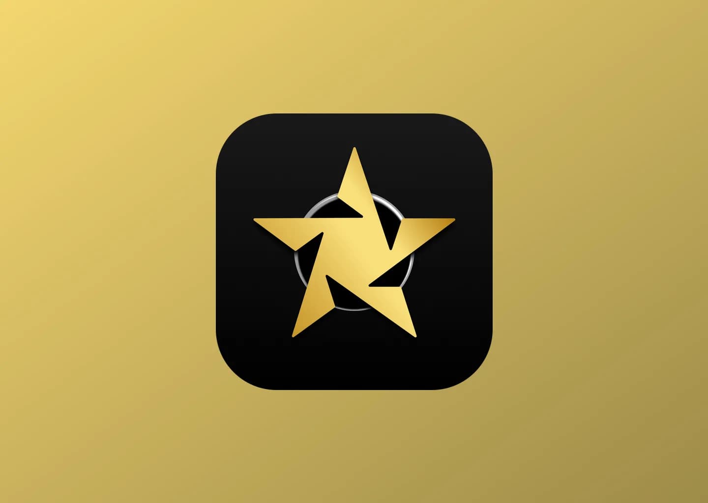
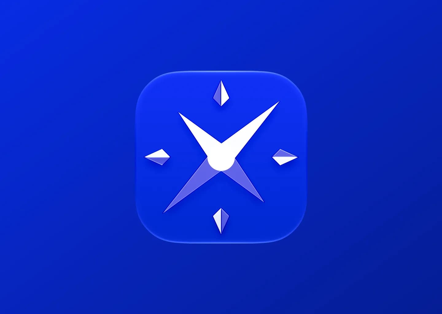
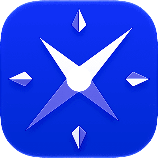
Todai's icon is assembled from four separate layers rather than one flat image. A left and a right diamond half, each drawn on a matching 913×913 canvas, meet in the center to form the gem-shaped badge that carries the mark; a small clock face and a compass sit inside it, the compass nudged off-center (-19.5, 27) so it reads as placed rather than centered. All four layers sit over a blue gradient base. Icon Composer keeps every layer addressable, so the same four pieces generate the light, dark and tinted renders Apple ships on the Home Screen without a manual export per mode.
Icon layers
- Diamond, left half
- Diamond, right half
- Clock
- Compass




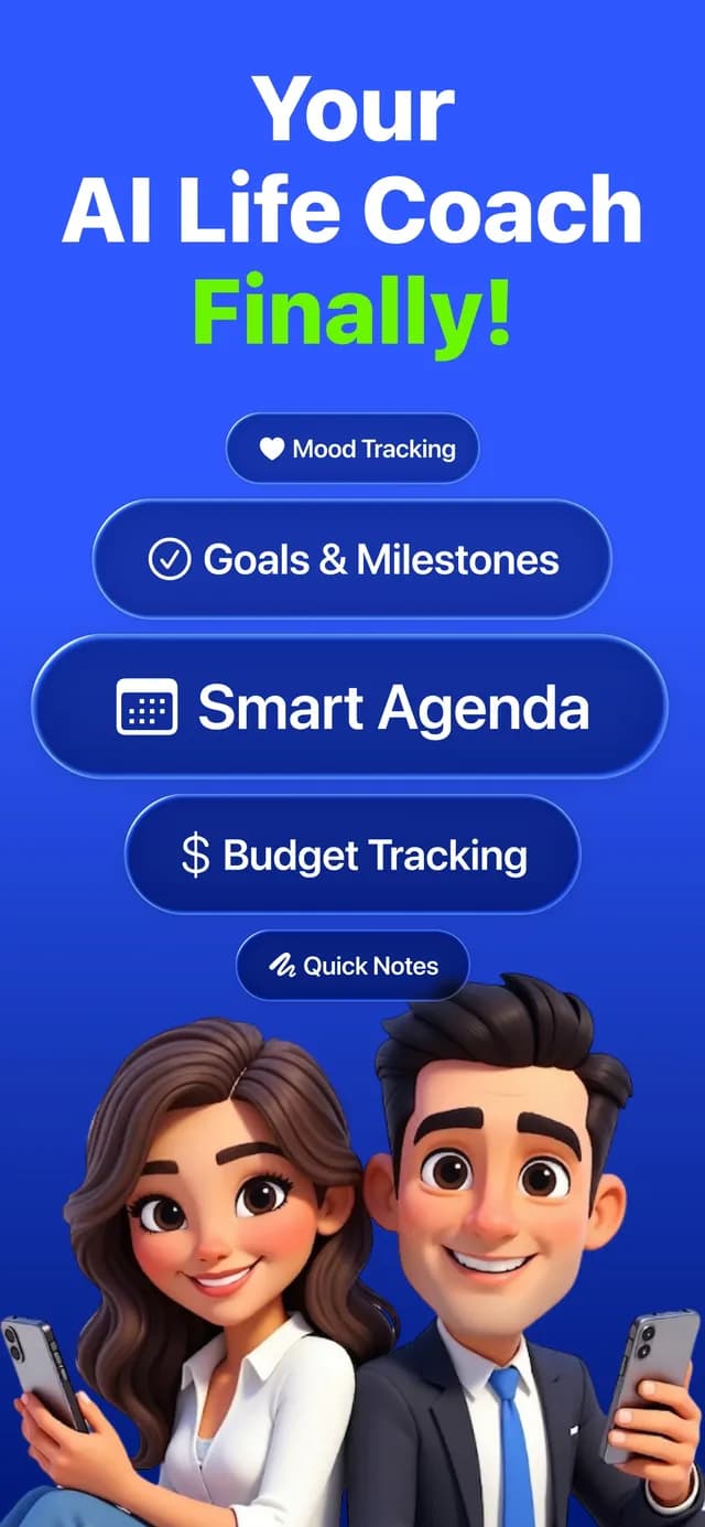
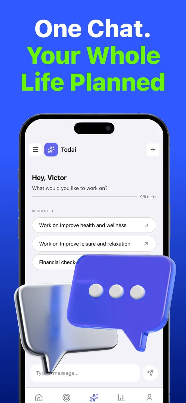
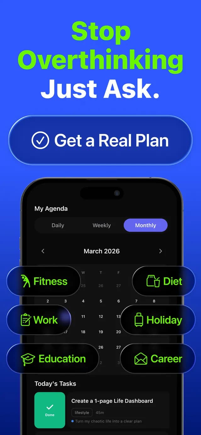
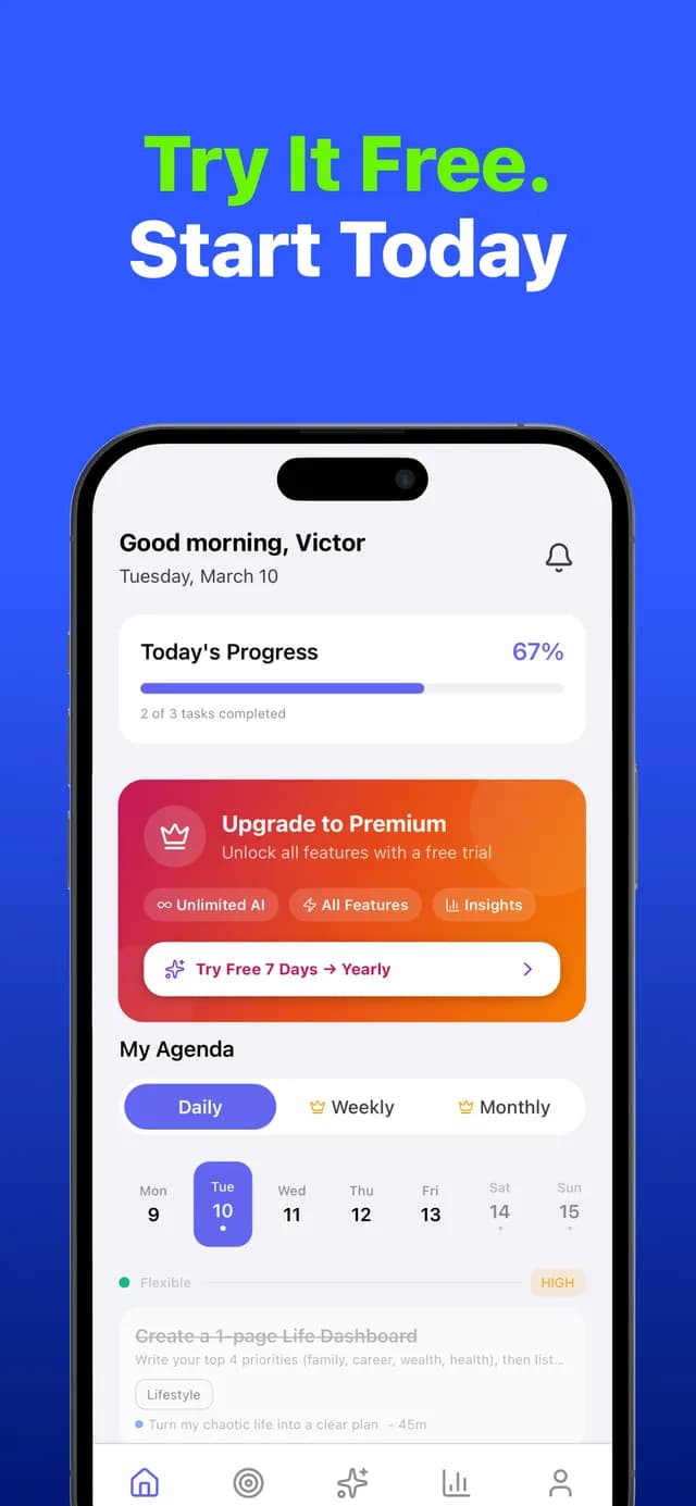
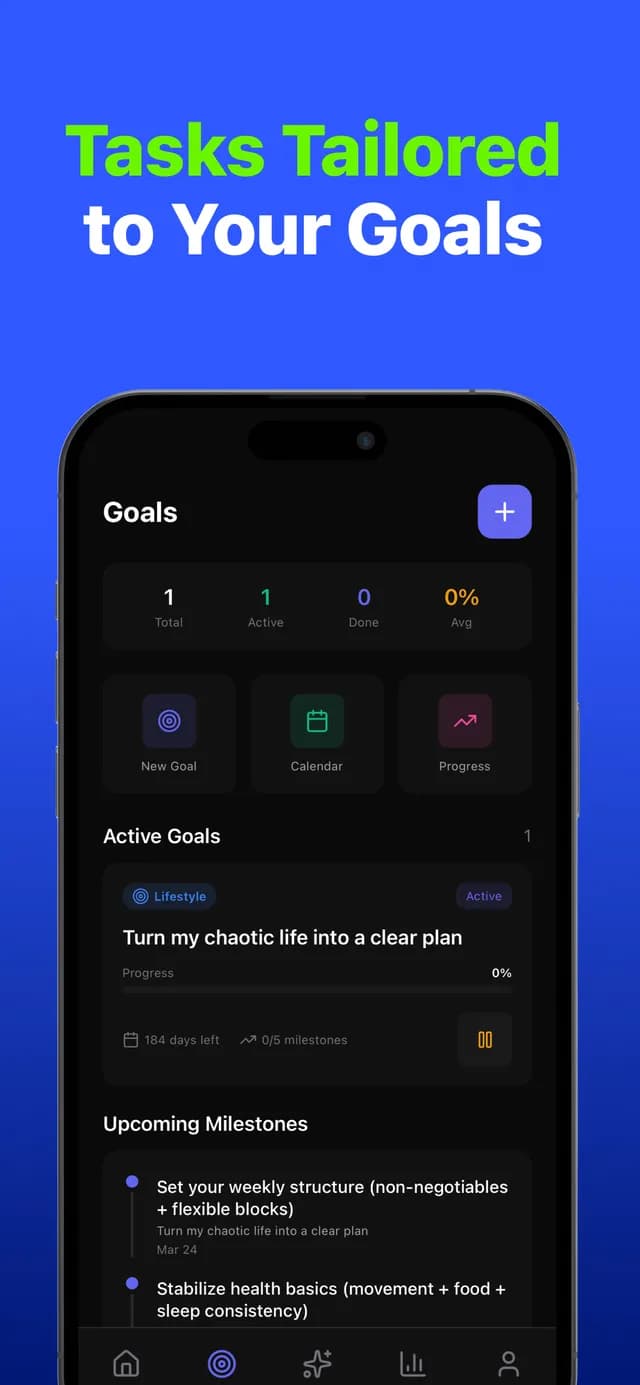
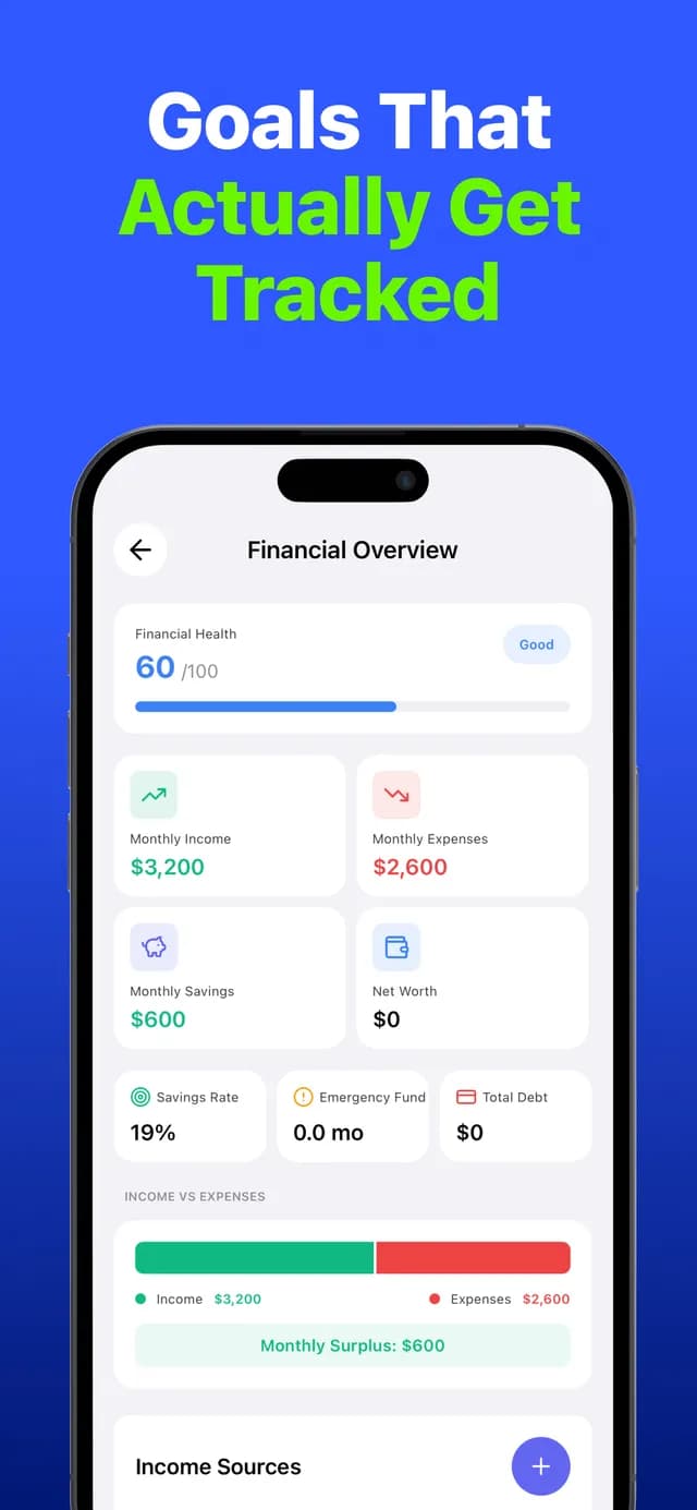
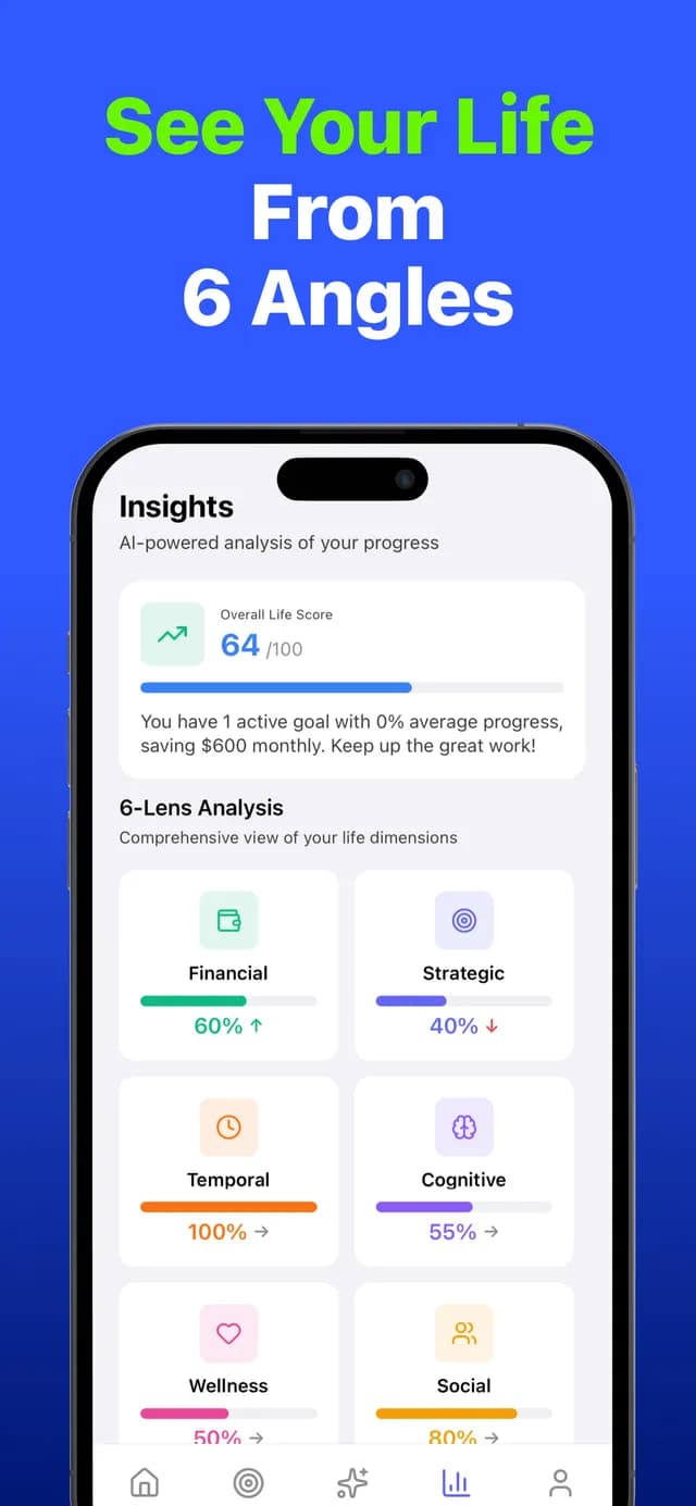
Shown here are the four editorial showcase locales. In production the same 7-screen iPhone sequence and 5-screen iPad sequence ship across 14 App Store markets.
- enEnglish
- trTürkçe
- ja日本語
- arالعربيةRTL
Live in 16 Apple locales. On Google Play, feature graphics are localized for 13 markets; the remaining Play listing locales fall back to the English (en-US) banner.
Store identity was written separately per platform: on the App Store the name field ("Todai: AI Life Coach, Planner") uses 29 of 30 characters, the subtitle ("Daily Goals, Habits, Budget") 27 of 30; on Google Play the title ("Todai: AI Life Planner & Coach") uses all 30 characters with a different emphasis order.
Todai: AI Life Coach, Planner
Daily Goals, Habits, Budget
Todai: AI Life Coach, Planner
Daily Goals, Habits, Budget
Productivity